Samsung One UI 8.5 When a Great Interface Loses Its Way
How One UI 8.5 Signals Samsung’s Fading Focus
Samsung used to understand something many tech companies still struggle with: software is not about features, it’s about feeling.
One UI was never just another Android skin. It was Samsung’s statement that power and usability could coexist. Clean layouts, smart one-handed design, and thoughtful customization made One UI stand out in a crowded Android world.
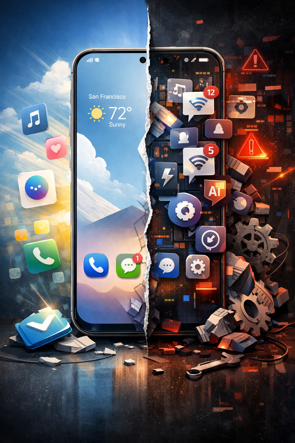
With One UI 8.5 Beta, that identity is starting to blur.
From Purposeful Design to Feature Overload
Earlier versions of One UI focused on solving real problems:
Easier reachability on large phones
Clear visual hierarchy
Customization that felt optional, not mandatory
One UI 8.5, however, feels different:
More features, fewer meaningful improvements
Visual tweaks that add complexity, not clarity
“Smart” tools that sound impressive but rarely improve daily use
The interface isn’t broken. It’s unfocused.
The Real Issue Isn’t Bugs, It’s Direction
Beta software always has glitches. That’s expected.
What’s concerning is the lack of a clear vision.
One UI 8.5 introduces changes that feel:
Incremental instead of impactful
Designed for marketing slides rather than users
Disconnected from long-standing user feedback on speed and simplicity
Samsung appears more interested in adding what’s new than refining what already works.
One UI Used to Respect the User
What made One UI special was restraint.
It didn’t chase iOS
It didn’t overload the interface for the sake of control
It trusted users to decide how much customization they wanted
In One UI 8.5:
Menus feel denser
Settings feel less intuitive
Customization feels deeper, yet harder to manage
Power is there. Comfort is not.
While Samsung Adds, Others Refine
Competitors are moving in a different direction:
Google is simplifying Android’s core experience
Xiaomi is rebuilding its interface with performance in mind
Oppo is prioritizing fluidity and consistency
Samsung, by contrast, seems stuck in a loop of addition without subtraction.
And in software design, that’s how elegance disappears.
Final Thoughts
One UI 8.5 Beta doesn’t mean Samsung has lost its edge. It suggests the company has lost its focus.
Samsung doesn’t need more features.
It needs clearer priorities.
One UI earned its reputation by making powerful phones feel human. If Samsung wants to keep that legacy alive, it needs to remember a simple rule:
Great software doesn’t try to do everything.
It tries to do the right things well.
If you want a sharper opinion piece, a shorter news version, or something styled for a tech blog or YouTube script, it can be reshaped without turning it into corporate wallpaper.
Comments (0)
No comments yet. Be the first to comment!